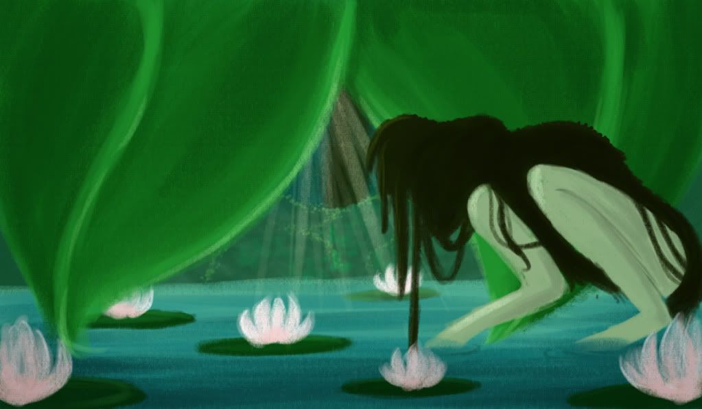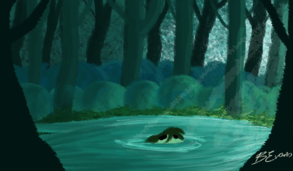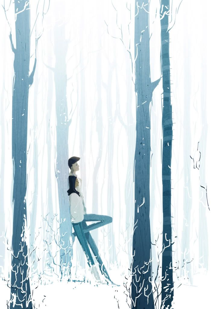

With meeting with James he preferred the more abstract ones but pointed out my colour depth isn't right yet and suggested I look at Pascal Campion's illustrations, his simplicity and amazing use of colour I will take on board but I feel I do need more layers and the film wouldn't work if it was too simplistic.
 |
| Pascal Campion- Sound of Silence |
Caroline did not like the Mary Blair look of some of my concept and suggested I look at giving some of my trees/forest and urban texture to create something new, instead of just putting a tree texture on trees but something that works but what you wouldn't expect.
Matt liked my first concept art from a few posts ago, I said it was more that kind of environment he had in mind when I explained my story and saw my character.
All tutors had very different opinions... so I'm still a little lost but the only why I'll truly know is when I do a final scene test and put my moving character in with her environment.
No comments:
Post a Comment