Monday 28 November 2011

Dragonfly Research

As I am positive I am using a dragonfly in my film I am concentrating on it's design and looking into the anatomy and the way dragonflies move and live.  One of the perfect reason I choose a dragonfly is that it only spends 5% of it's life as a dragonfly, the rest of the 95% is underwater.  So I feel it's life story goes well with my creature also, that even though it's brief it leaves it's water and lives it's life.

I first watched a little documentary of dragonflies that touched upon their lifespan and their characteristics.  I looked at two David Attenborough  documentaries, one that specifically looked at dragonflies and damsel flies, 'Dragonfly - Beauty or Beast.  I also looked on some clips from 'Life in the Undergrowth', both very helpful for reference and the behaviour of Dragonflies.

I noted all useful information to see if I could apply it to my film.


Photobucket

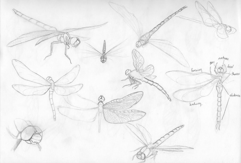
I then did a reference study into the anatomy of dragonflies,  most bodies were roughly the same, nothing as different as the frogs I was studying earlier on.  Only slight differences in the tail length, colour and head shape.  I think I will be designing my dragonfly a bright aqua colour to stand out from the dark greens, but I need to play with in environment concept before I know what will work or not.

Photobucket
I then looked into how I might stylalize the dragonfly, but so far just concentrated on the wings, as that is one of the key aspects the audience will notice.

Photobucket

Rough Animatic 1 - Feedback

Over the last week I have put my animatic on the internet and getting as much feedback as possible from animation students, friends from home, and tutors.  Overall I feel I have gathered a reasonable about of feedback to improve my next animatic:
  • When the creature sees the light and is unsure about it, that scene could be cut down to just a couple of actions spanned across maybe even just one or two shots.  
  • Gemma Ursell lied how the light is shown as a big issue for the character, and thinks it's a simple story that 3 minutes can work well with.
  • Sin liked that the storm had been moved the the beginning of the film now but felt that maybe just before it would be nice to see the character happy at some point.  She also suggested that at the end have her do a little dance with the dragonfly to satisfy her craving of wanting to see the monster happy at the end.  
  • Sin also stated that the film works much better now that it has been stripped down to it's basics and making it slow but more powerful.  
  • Pablo liked the interaction with the light beams for the first time.  He suggested that the dragonfly needs to be included in the final shot somewhere around her to to seem like it is threatened by her.
  • He also suggested that the dragonfly could be startled to fly away by a drop of water etc rather that just fly away and the audience may be getting confused with it just not wanting her company.
  • Gemma Roberts pointed out that a few drawings were unclear on what exactly was happening, and that I should hold some shots a little bit longer, less cuts, and that slower editing suits my film.
  • She also noted that when working into my next draft that I need to make it more clear that the pond has been effected by the storm.  
  • Owain who had for the first time seen my film idea and animatic thought that it was about a lonely creature and no one wanted to be her friend, this was from the dragonfly flying away, therefore I think it would be better if the dragonfly got startled like Pablo said, rather than the creature maybe scaring it away.  
  • Caroline liked the structure but agreed that there needs to be more of a building of tension and I need to look at my graph of action/pacing.  She also noted that there needs to be a shot of the creature responding to who she's looking at the end when she leaves.  
  • She also suggested that the scene with the dragonfly needs to be expended, have the creature chase or follow the dragonfly around the pond on a playful way and then it flies away.  Matt also suggested this and to think of it as chasing a butterfly, it is seen as harmless. 
  • Leonie suggested that when she leaves the pond that she should lift herself up somehow, like climb over a log otherwise a back silhouette of her crouched down will look unappealing and confusing.
  • Caroline also mentioned my creatures design,  I must be careful with her poses, as my character is naked and I have adapted some frog-like poses I must be careful that they aren't seen as sexualised.  Therefore I am making sure my creature is mainly hunched, have more hair covering her than skin.  
  • Loads of people agreed that the music goes very well with the tone and pacing of the film, so I am going to try my best to find a composer who can producer something along the lines of this piece.
  • More than one person suggested to end the film just when she leaves the pond, the audience doesn't need to know where she goes.

Overall I think my feedback went quite well, there were no major plot or structure errors and I feel minus my environment design I am on a solid track to completing my final animatic.

Environment and Colour Key Concept Art

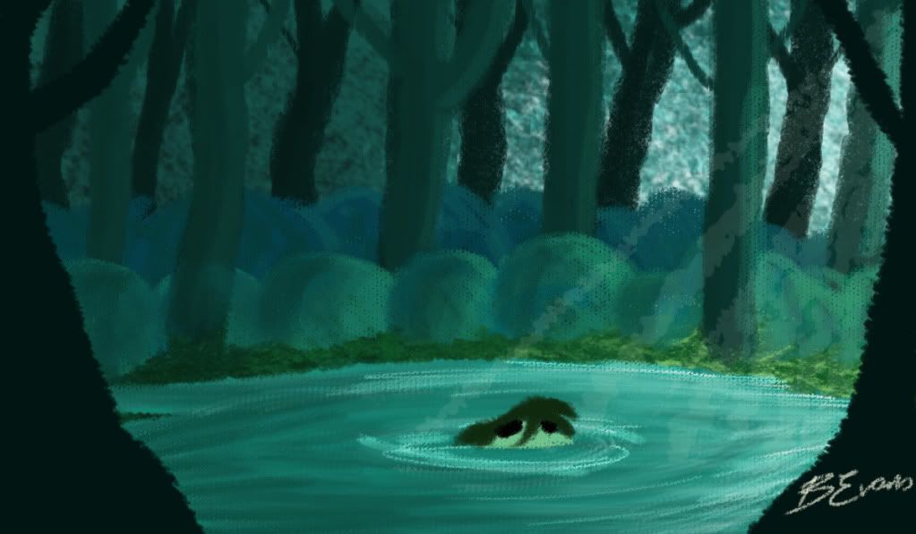
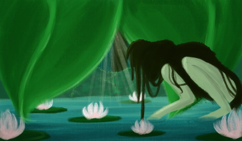
Again playing with different brushes and looking at a bit more abstract artists I tried to find a final design to what the creature's pond would look like, as the environment plays such a huge role in the film I have to get it right. Since I have almost no experience in environment design I am aware that my colour and depth isn't quite right yet.  However medium wise I am reasonable sure I will be creating my environments in Photoshop, but adding some textures I feel looks best, abstract or detailed.


 Photobucket

Photobucket 

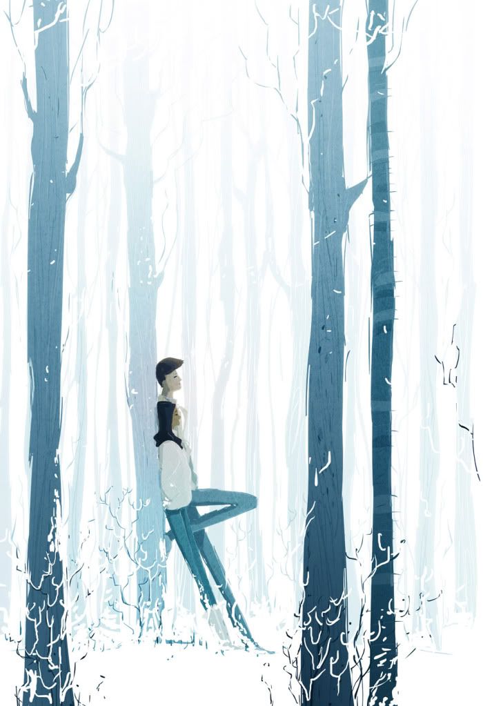
With meeting with James he preferred the more abstract ones but pointed out my colour depth isn't right yet and suggested I look at Pascal Campion's illustrations, his simplicity and amazing use of colour I will take on board but I feel I do need more layers and the film wouldn't work if it was too simplistic.
Photobucket
Pascal Campion- Sound of Silence

Caroline did not like the Mary Blair look of some of my concept and suggested I look at giving some of my trees/forest and urban texture to create something new, instead of just putting a tree texture on trees but something that works but what you wouldn't expect.

Matt liked my first concept art from a few posts ago, I said it was more that kind of environment he had in mind when I explained my story and saw my character.

All tutors had very different opinions... so I'm still a little lost but the only why I'll truly know is when I do a final scene test and put my moving character in with her environment.

Friday 25 November 2011

Thunderstorm Concept Art

With the story now finally piecing together I feel confident enough to design some more concept art.  I know there will defiantly be a thunderstorm at the beginning of my film, I want it to be a fierce angry storm.

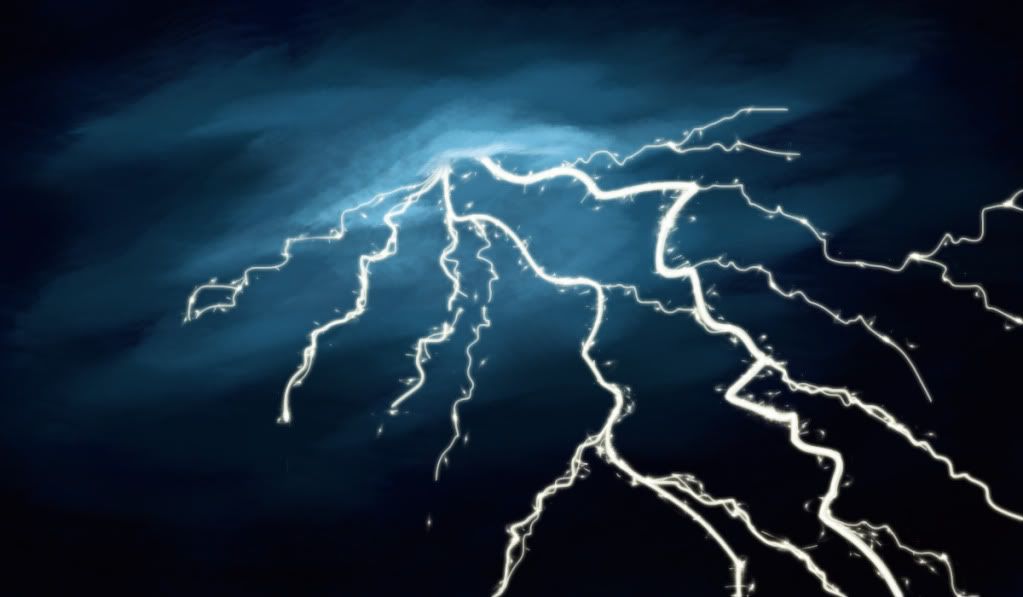
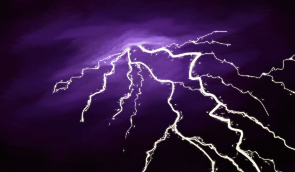
Again with Photoshop I messed around with some different brushed for the clouds and lightning the final product was this:


Photobucket
First attempt, I liked the lightning but I wasn't sure of the colour?

Photobucket
I changed the hue to purple and I think this has a much more powerful evil presence than the blue.


I will show some people and find out which colour scheme is the most frightening.

Rough Animatic 1

At the seminar, I presented my 3rd storyboard to James, and it went quite well, the storm at the beginning worked and dove straight into the story.  By having the character react so curiously to light it will be obvious to the audience she has never seen it before, which hopefully did come across in the storyboard.  James's only crit was:


  • An environment shot [establishing shot] needs to be placed right at the beginning, to have an overhead of the forest to show there is no tree canopy.
  • Everything should be in threes.  There seems to be a pattern in my film of my creature (I REALLY need to name her now), she gets curious, is drawn out of hiding then scared and returns to hiding.  So far this happens twice in the film.
  • James suggested that before the dragonfly is presented that a branch that was caught up in the trees falls to the ground and therefore lets more light in, this can also be the third thing that scares the creature.  The fallen branch will not destroy the pond though, I have made it a priority that the pond not get ruined, the creature must leave not by force but by choice. 
  • He also suggest that the end with her making it out of the forest should be cut too. I think I will show this animatic to more people first and see if they feel the same way.

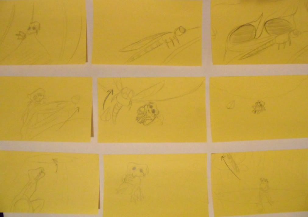
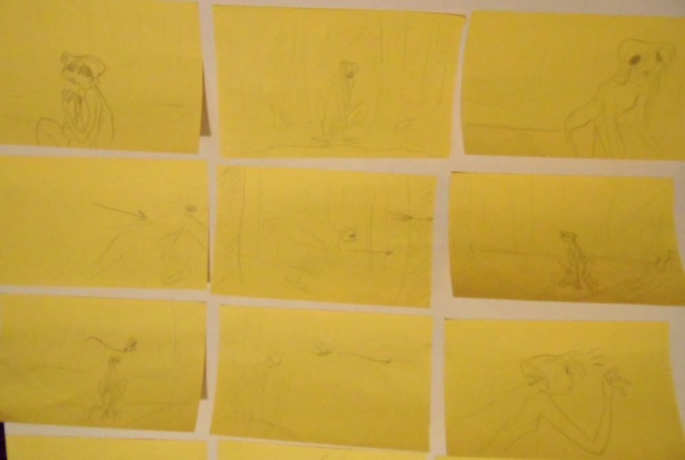
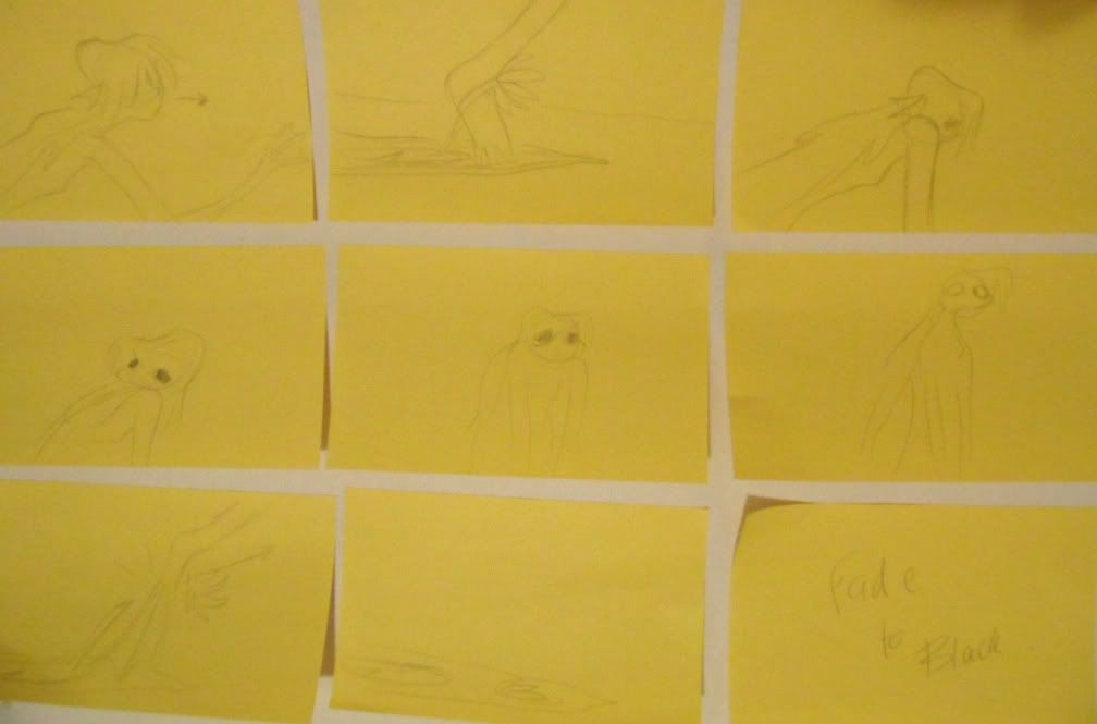
With those factors taken note James suggested that I am ready to start my animatic and see how the film's timing etc is so far without the added notes of the seminar.  With simply taking a photo of every sticky note, cropping and compositing on Premier Pro, I also applied some diegetic sounds and then thought about what music to put after the storm? I knew it had to have an almost mystical feel to it.  I typed in 'pond music' on youtube just to see if anything came up, and the first choice was Doctor Who's Amy Pond theme, I giggled to myself and just clicked it to see what the music was like... and to my surprise it was quite similar to what I had in mind.  So out of curiosity I added it to my animatic and in the freaky way the timing went too well.  Obviously I can't use this music, but I would like for my music to have the same feel as this does... and the timing... how the heck does the timing go so well with my animatic?


I don't know why there are little static noises' throughout the video? it is only on youtube not on the original?

Sunday 20 November 2011

Character Colour Tests

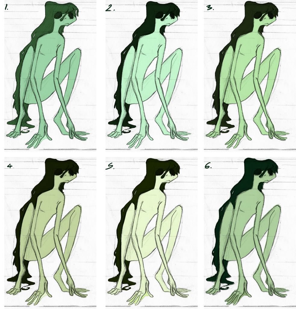
With a rough indication on what her environment will look like and that I have a good idea on what type of character my creature is I did some colour tests.  It was important that since I have now gotten rid of her gills that the audience knows straight away that she is NOT HUMAN! so colour plays an important part. Since she is an amphibian she breaths underwater through her skin, which is also moist.  I decided green would be the most suitable colour, getting just the right shade is important as I don't want her to look like an alien either.  Her hair is meant to me almost like slimy dreadlocks, so a darker mucky green I thought would do best.  I think 4 and 6 are so far my favourites, they just look a bit more natural and not super-natural.


Photobucket

Friday 18 November 2011

Background Concept Art

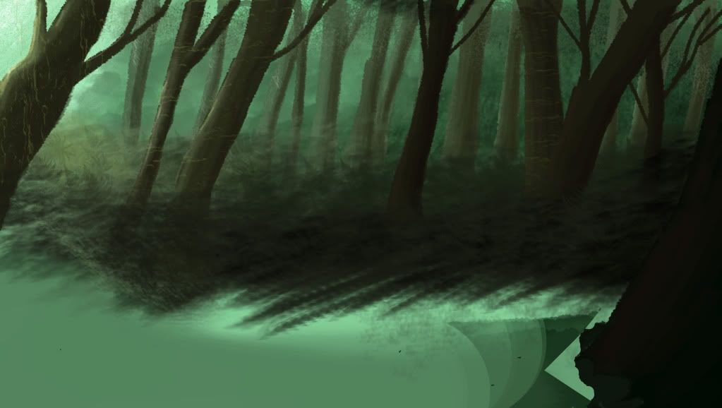
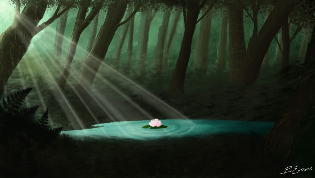
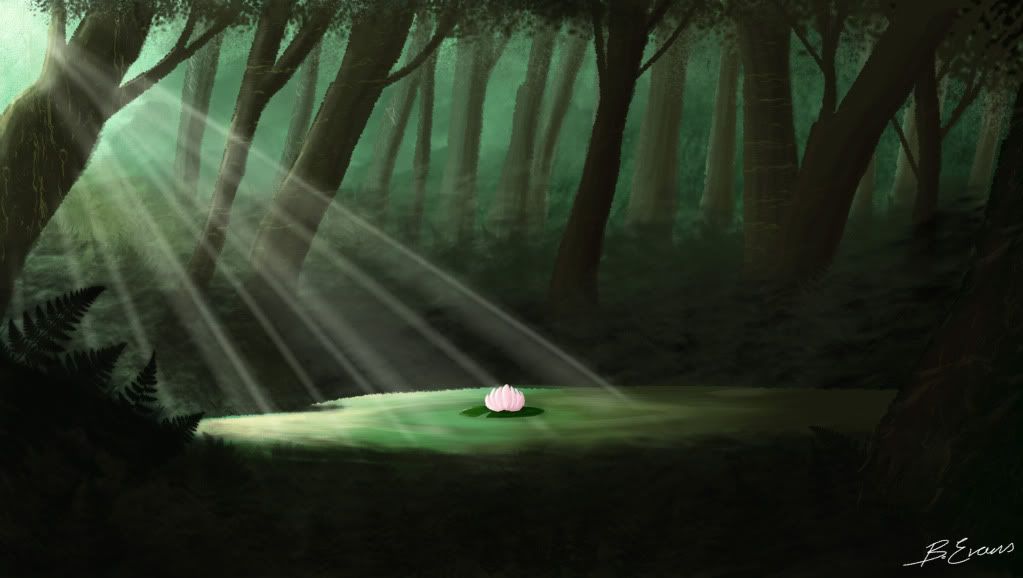
I noticed I hadn't really had a good think about what her environment would look like, now that I'm fairly sure my story wont change much, and that the story will start the day after the storm I decided to do a little photoshop painting of what possibly might be what the final background may look like.  With the use of different photoshop brushes and textures along with expensive research in colour of forests I had a go at practically my first background fully coloured concept art.

Process:

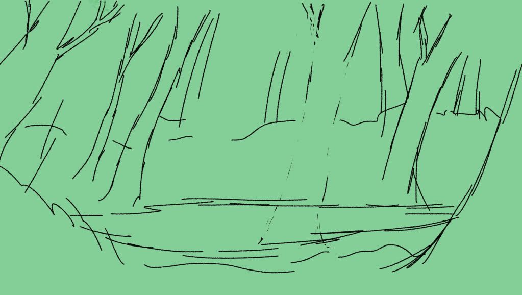
First of all I roughly drew out the layout of the scene, such as the trees, background and foreground and where exactly the pond was going to be, it had to be in the middle as it the centre of the story.


Photobucket

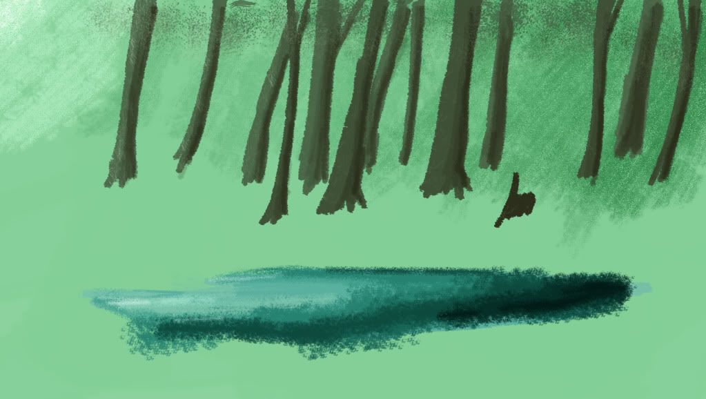
I then decided where the light source was coming from,  I chose the left as that is the most comfortable for the eyes to read, and I was the light source to connotate a positive reaction despite it's heavenly appearance at the end result.  I also started setting up the background trees and the misty background, it had to seem never ending.

Photobucket

I then started to colour in the foreground trees an illusion of depth is starting to appear.  Along with some use of textures on the trees to make them seem less flat.

Photobucket

I then started to apply the ferns and undergrowth in between the trees.  I also started to add some darker shades onto the right side to add a real light vs dark sense of the film.

Photobucket

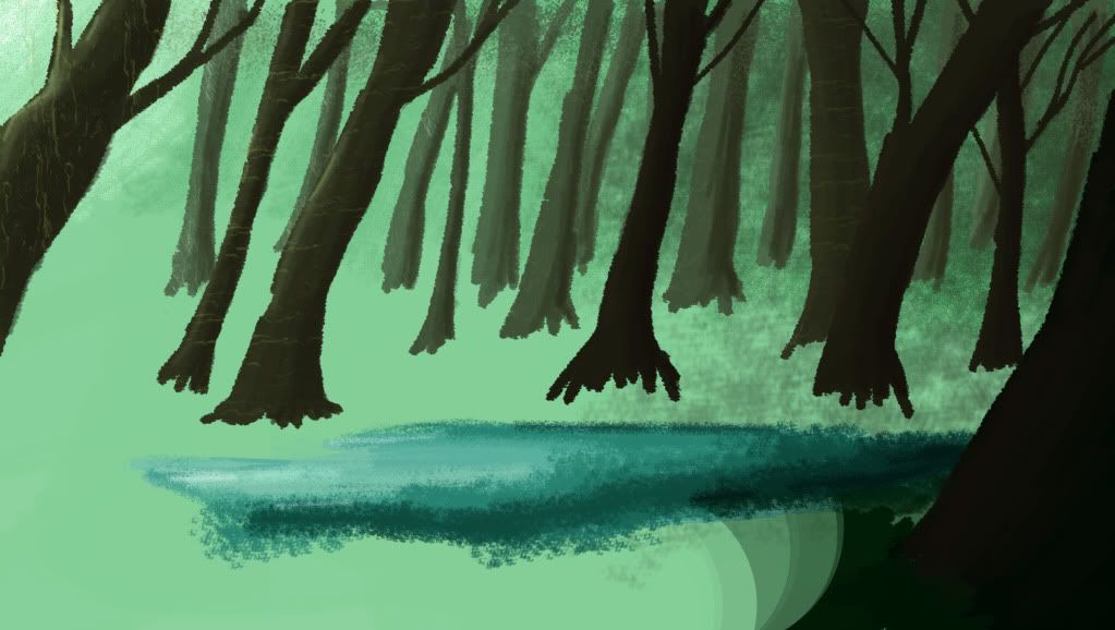
I then added the much darker fern foreground and added a lilly pad and made the light and dark much more contrasted.  I was unsure whether to make the pond a pure blue or a mucky green.  Green does seem more natural but blue does make the pond seem a lot more special.  I will get some feedback to see if this sort of style is suitable for my film.


Photobucket

Photobucket

Monday 14 November 2011

Storyboard 3

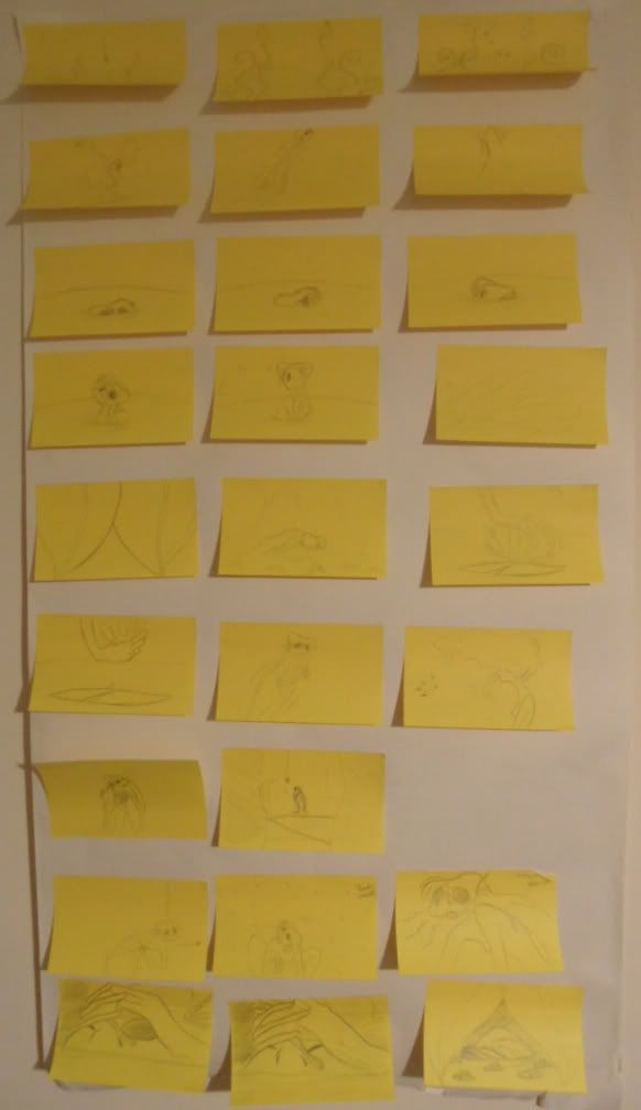
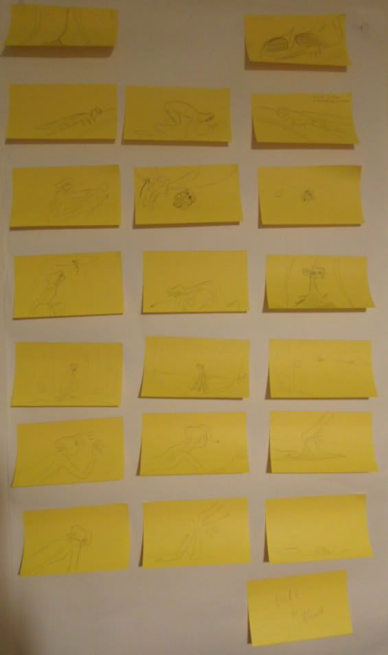
At this weeks seminar I showed my new storyboard even though it wasn't completely the way I wanted it and it was still sort of a frankenstein storyboard with some frames from the old storyboard so the layout is all wrong in some parts but it was just to present the basic story.


Photobucket

Photobucket
Photobucket Photobucket Photobucket Photobucket Photobucket Photobucket Photobucket


Feedback
James and some students looked at my storyboard, I knew there still wasn't something quite right about my story, it didn't have that spark that I was expecting, and it just seemed a bit predictable with the structure.


  • James suggested that I have the storm of my story at the beginning, and asked why shouldn't it be? The problem I had with the storm at the beginning was that I felt that the audience wouldn't understand the creature's life before the storm.  But James insisted that with the right character performance that audience would know exactly that the character is reacting to a change in her environment.  I just have to have a large amount of faith in my acting as well the my faith in the audience.
  • James also suggested that the open tree canopy appear after the storm and only after it will the creature have an open view of the outside world, this would also make more sense how the dragonfly got into her pond.
  • With the storm at the beginning, the audience will be just chucked straight into the story and I do feel that the being is less.... boring now.  If there's anything I don't want to make it's a boring film.  Worst nightmare.
  • A talk with some students and again I need to work on my layout and angling.  I thought I would be good at this but it is much harder than expected, though I am determined to make the most of my layout and play with the space to create the best atmosphere for the scenes. 
  • Osamah suggested that my film is more of a feeling film that a completely story driven film with lots of 'things' happening, which I suppose now thinking about it and since all the 'things' have been taken out of my film it is defiantly more of a feeling film. Which means it is essential that I get the mood and colour right, along with brilliant character performance. 
  • Jess also suggested a cute little way to introduce the dragonfly which I will apply to my new storyboard that I will be working on this week. 


Upon how to improve my story James suggested that I take a look at a 1973 animated short narrated by Orson Welles, Plato's Cave.  The Greek myth of four slaves chained up facing a wall in a dark cave, behind then is a flame and objects are placed in front of the flame to cast shadows of the objects and it is those shadows that the prisoners believe is real, not knowing any better.  Then one prisoner is freed and shown that what he thought was real was simply an illusion and is shown the outside world for the first time.  At first he is startled by the light and it takes some time before his eyes can see the full objects that are real that cast the shadows in the first place.  He then learns of the world and tells his fellow prisoners about the outside world, but they laugh at him and say he's crazy, as of course they know no better.  So the freed prisoner returns to the outside world as why would he return to the cave now that he has a new perspective on life.


I had never heard of this myth before, but I can see how it can help me with my film and some people may associate my film with this story so it is good to be aware of it.  I like how the prisoner reacts to the sun for the first time, so I may try to adapt a similar reaction in my film.  It all depends on how big the canopy is, where it's a small gap or a massive whole in the trees.

Friday 11 November 2011

Continuing Animation Test

As well as sorting out my storyboard I did some more designs for my character, though this was before my pecha kucha presentation and learnt that I do need to re-design my character slightly.

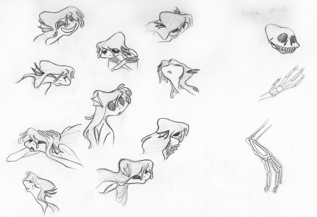
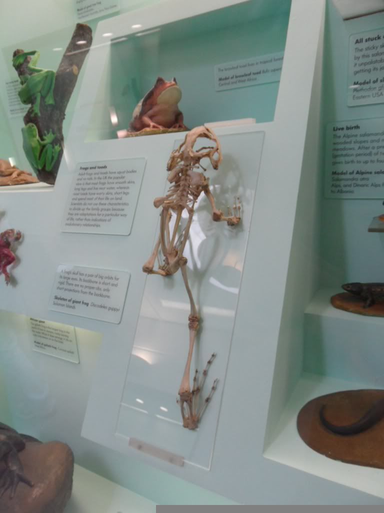
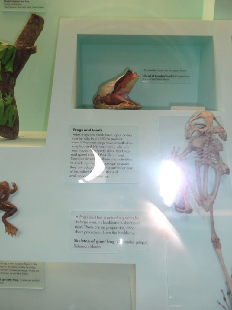
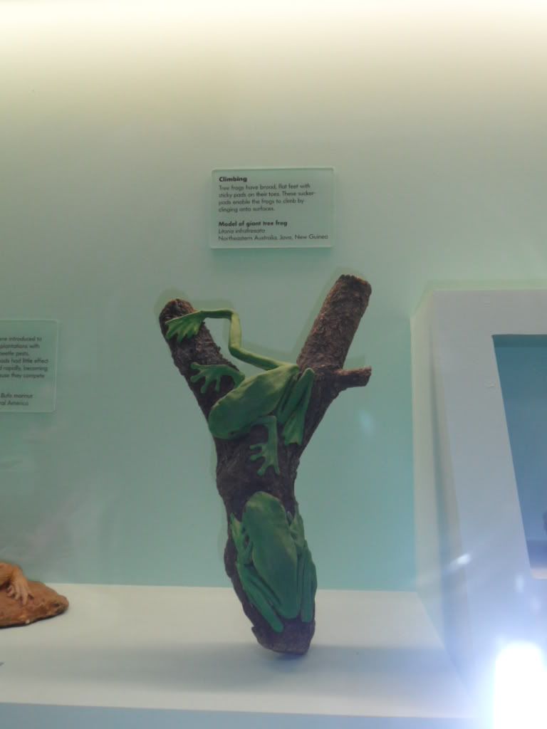
I did some head-shots of the character, looking at different angles and different expressions of her face. I also looked at her inner skeleton structure just to help to the animating process and where exactly the joints move.  For reference to this I took some pictures from the London National History Museum and there was a skeleton of a frog.

Photobucket

Photobucket
these skeletons were very helpful for the anatomical structure of my creature (at the Nation History Museum)
Photobucket   Photobucket
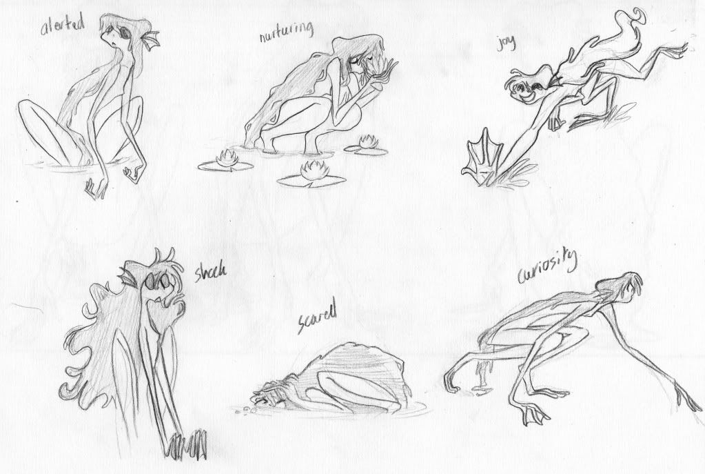
 As well as that I looked at the key expressions that my creature will express in the film, though since changing my storyboard the emotion of joy and nurturing are being removed, therefore just leaving alerted, shock, scared and curiosity.


Photobucket


I also did another animation test, this time underwater.  I thought it would make sense if I did a test of something she's actually be doing in the film, so in my storyboard the first thing she does is wake up and do a big yawn.  I think I got the acting quite well, but I think I will defiantly need to add some bubbles to complete the underwater effect.  I also like the hair flow and the applying the Mucha style I think it works well underwater, and I do want her to be much more elegant underwater compared to her on land.

Thursday 10 November 2011

Storyboard... down to the core

Later on this week I met up with Leonie as she did seem to give me the most feedback at my pecha kucha presentation and so I wanted to ask more about re-designing my character as I didn't know where I needed to start with that.  However the meeting didn't even really touch on the design of the character but rather my storyboard.  Leonie said she liked the message of my film but that it would be more powerful when she ... slightly re-arranged my storyboard.


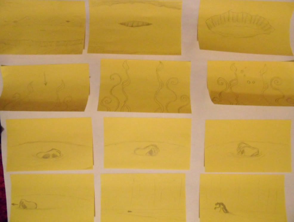
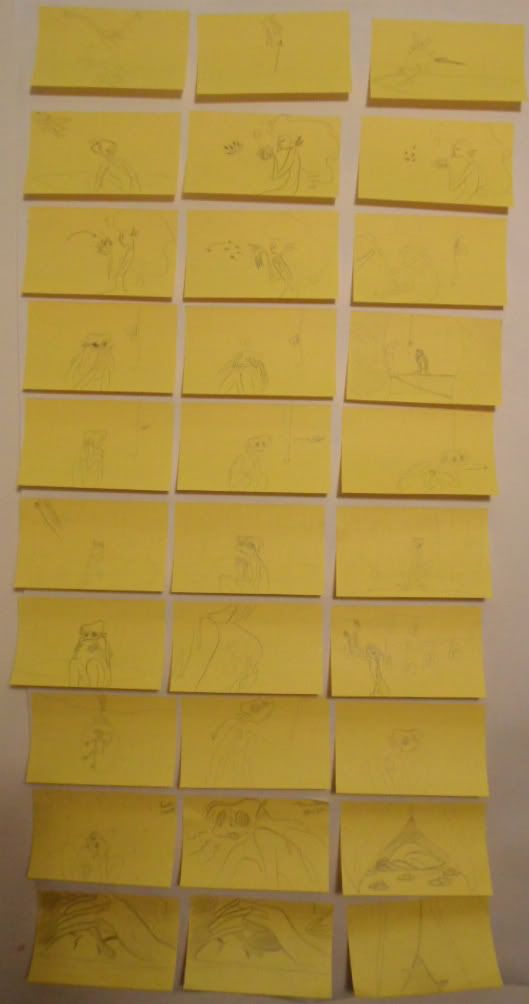
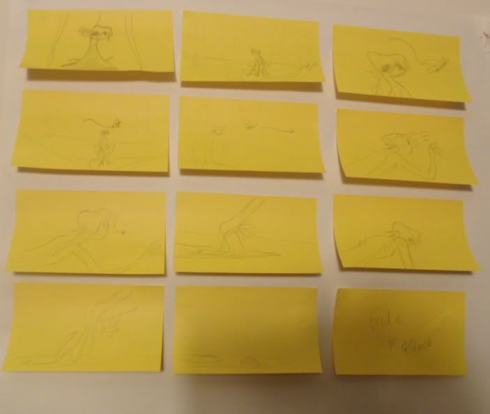
Photobucket Photobucket


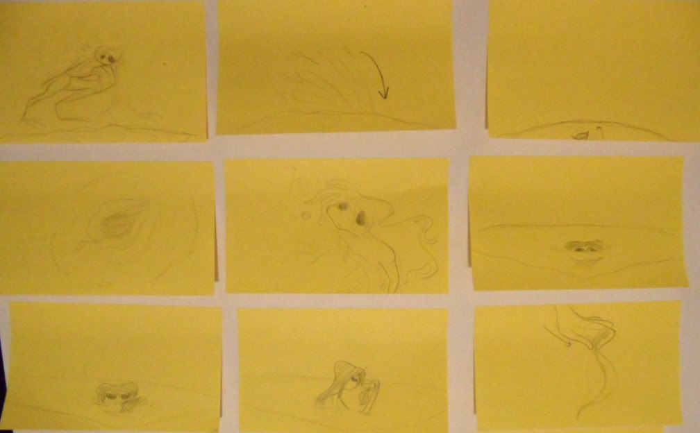
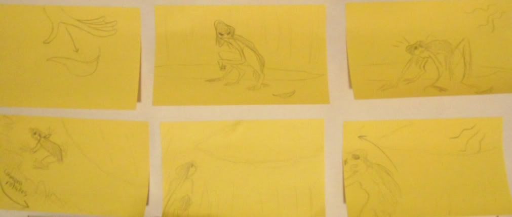
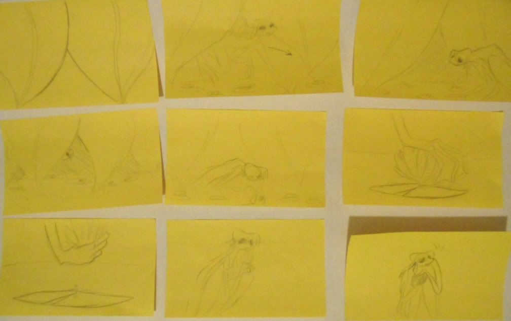
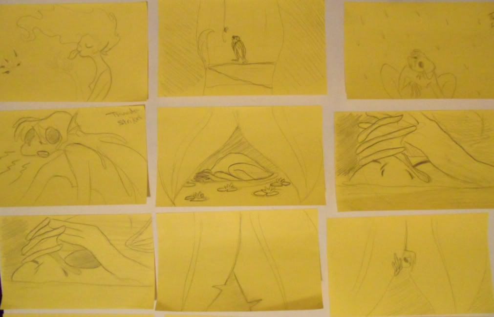
My storyboard was now only 2 pages and 46 sticky notes.  Basically ripping my story to it's core and taking out all the 'stuff' the creature does in her day, the pond now seems a lot less friendly and less happy to live, as before I was slightly worried that it was maybe a little too nice to live and that I hadn't created a good enough reason for her to leave.  The inhabitance of pond have now also gone, so my creature is a lot more lonely but does not know any better and is also a lot more terrified of the outside world, therefore her leaving is much more of a triumph.

According to this storyboard the synopsis goes like this:

A solitary pond creature lives her life in her still lonely pond, isolated from the outside world she remains in her pond too scared of the unknown outside world to leave, her only view to the outside is the top of the tree canopy.


Every day is a struggle as the slightest noise startles her.  Her only real comfort is her small lilly pad garden that is also her food source, she gently picks a flower and timidly nibbles each petal.  


She wonders to the edge of the pond and doodles some abstract shapes in the mud but then suddenly hears an unknown noise from beyond the trees.  Then suddenly it starts to rain and the pond comes to life with rain drops hitting the surface.  Suddenly an almighty thunder storm appears and the creature frightened out of her wits seeks safety in her lilly garden (her only company after all).  Thunder flashes and the rain heavily beats on her pond.  


Morning arrives and the creature shakily emerges to see what has become of her pond.  From the heavy rainfall her pond is slightly overflowing and a small stream of water is leading off into the unknown forest.  Panicing  the creature doesn't know what to do?  She goes to the edge of her pond when suddenly some glistening in the distance.  


A beautiful dragonfly resting on a leaf catches the creatures eye.  She is stunned by it's beauty and slowly approaches it.  The dragonfly then whizzes off to the canopy and heads through the forest.  The creature without thinking flows it, racing through the trees until she comes to the edge of the trees where two giant trees have been uprooted from the storm and for the first time she sees the bright sun, the dragonfly flies around her freely and the creature at first is scared to go any further but then sees how the dragonfly just lives it life and is much more happy in the few seconds of seeing it that all her days of being in her pond.  She sees the little stream of her pond flow down the hill and she looks up and takes her first step into the unknown.  But her ankle is tied up on a lilly pad vein, she looks back at her pond for the last time then holds herself up confidently and walks out into the big wide open world.


I am slightly concerned that maybe the beginning could be quite boring if I don't lay it out right and that the audience wouldn't instantly be captured into the character and world I have created as this version is a lot more depressing in the beginning.  I am also a bit concerned that the since the drawing on rocks part has been removed that the character will seem a lot less interesting, as except for being scared and eating she doesn't do much.  The rock drawing according to Leonnie had represented cultural issues?  I'm not hundred percent what it means but I was informed that I would be shooting myself in the foot if my creature was decorating her pond with stone drawings.  I did really like that touch of the film though, so I am still not 100% if I will cut it out, that is however why I added her doodling in mud, just so she was doing something, and also to show her creative side, and that she doesn't just have the complete intelligence of an average animal. 

Pecha Kucha Presentation & First Storyboard

I was a week late with my pecha kucka presentation as I was ill the week before, so unfortunately had later feedback from the majority of the class, none the less I had my presentation the following week.  My feedback from my presentation was al right, I didn't have the storyboard on my presentation as I felt that would have taken up the entire presentation and I felt it was better to use the presentation to show all my research and process of the character and design as well as the overall message I want to convey.  I also wanted to show my storyboard on a separate tutorial.  My feedback was mainly from Leonie that my creature's design needed work and that it didn't go with the feel of the film I was describing.  


First Sticky-Note Storyboard


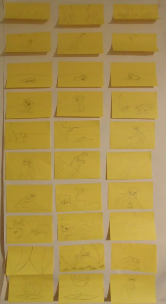
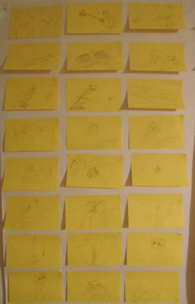
Photobucket Photobucket Photobucket Photobucket

That week I was ill I had drawn up my first sticky note storyboard, which is most helpful for people interacting with the layout of the story and easy to fix is some scenes need to be added or removed.  I filled up 3 large pages with 99 sticky notes, it looked a little long and I didn't really have a clue how long it would be until I turned it into an animatic.  I took my storyboards with me on Monday to show my seminar class and James.  Unfortunately James did not have time to see me that day but I did get some helpful feedback from some students.

Feedback:


  • Need to make it a bit more clear that the creature wants to leave the pond.
  • More establishing shots, I don't actually have any establishing shots at all and less reaction shots, some long slow shots can be much more effective.
  • Use different angles, mix it up a bit and play with the mood of the shot more.
  • The low angle of the creature looking up and the dragonfly flying out to the open of the tree canapĂ© needs some work, making the creature smaller and putting her in the corner of the shot will make her seem less powerful in the shot and put more focus on the dragonfly.
  • At the end the butterfly should lead the path to the creature's freedom.
  • My story ends quite quick so there could be a couple of ways I could lead up to it by adding more slow, quiet shots to show my character's decision.
  • A shot of the creature looking back one last time at her pond before she leaves is needed just to have a sort of a goodbye between her and the pond.
I then met up with Matthew Gravelle said I had a good structure to my storyboard and that it was very clear to read and that an audience would not be confused reading the story visually but that I needed to show the character's desire to leave the pond more with a shot of her face looking sad or some sort of reaction shot.  He also noted that my film did feel a bit more like a trailer for a bigger film and that it just kind of ends suddenly and leaves the audience wanting more, which I always thought was a good thing but maybe not in this context.

So overall so far I needed to work on my scene layout and somehow work on making the ending seem less sudden but not add more time to the film.... mmm


Sunday 6 November 2011

Case Study of Father and Daughter.


With a lecture with Caroline we looked at the visual construction of Father and Daughter and how Michael Dudok de Wit uses such limited detail yet it is clear to the audience what is being shown and to it's best effect. 

Now I am trying to achieve some of the points that Dudok de Wit has achieved but he doesn't use any face animation or close ups, that is one thing I really do want in my film, but I did certainly look at the other factors I could apply to my film.

  • The variety of layouts, he uses a mass amount of different angles even though most of the film is of the same location, he also uses different times of day and weather to make it more interesting.  
  • Dynamic framing, some could call this film very flat, which at some times it is, but some shots are quite dynamic with clever use of angles without the characters looking flat.
  • A good use of contrast in the film makes it visually interesting and exciting for the audience and for the progress of the story, from flat to depth, calm to danger, large to small etc.
  • It's use of tonal range gives the film a nice variety in it's same setting and the use from high to low contrast 
  • It's simplistic backgrounds most interest me, as I am having trouble deciding on how the environment is going to look like, I love the simplistic look of the trees and use of washed colours and grainy textures.
  • The use of shadows is very present in this film, it highly defines the character's silhouettes and also makes them stand out from some of the backgrounds even though the whole shot is all very similar tonal colours. 
  • Mirroring the characters in some puddle reflections is a good way add some dynamics to the shot. 
  • And finally the use of space, the film always seems to be like it's set in a big open space even though there is not much on the screen.  The use of layout and where to put the floor lines is cleverly placed.  I think I will have to have a closer look at this technique when I'm on the final shot of my film as I will not be showing the big open space but I want the audience to feel like there is one.