Saturday 31 December 2011

Storybeats and Colour research

When presenting my presentation to the class I showed some coloured storybeats, that gives a good idea what a finished frame will look like.  The criticism I got was that some frames are too dark and that all of them look generally muddy and there is too much brown.  I was suggested to add some other colours like perhaps purple.

Photobucket
As research I looked at existing forest backgrounds in animated films and some illustrations, more preferably at night.

These are some illustrations from various illustrators, some are a bit too abstract for my film, but the use of colour is interesting.

Photobucket Photobucket Photobucket Photobucket Photobucket


 The rest are either concept art specifically for an animated film or an actual background, mainly from Tarzan.
Photobucket
Concept art from jungle book
  Photobucket Photobucket Photobucket

These too are the most helpful for me as they are dark and there isn't as much sun light present.  The night one is the most interesting as one of my big problems with my storybeats colour tests was that the night was too dark and just lots of browns and black.  But in Tarzan there are no browns or blacks at all, mainly blues, yet it still reads as a forest.  I will experiment with blues at night with my film.
Photobucket Photobucket

Saturday 17 December 2011

Schedule and Budget

Schedule

To organise my timetable for next year I planned out a rough schedule and estimated how long it will take for each section of work for my film.  So far I am on track, my rough dissertation is handed in, my working life report is almost complete, so I can concentrate on finding a composer, and completing my detailed animatic and 30 seconds of feasibility tests. Photobucket

Budget


Looking at my budget, I have most of the equipment I need already.  But I have listed here what I have and need and how much the overall cost will come to:

Pencils (2B-3B)  -  £3.47
Tesco A4 white copier paper (75gsm)  -  £20
Masking Tape  -  £1
Post it notes  -  £2.50
Wacom Intuos 4 graphics tablet  -  £331

This is not including all that I already have and will use such as Adobe software and the lightbox.

Colour Scheme

Colour is something I have little experience in, which unfortunately for my film's readability it relies greatly on the colour and layout.  I have tried to do as much research as possible by looking at varied illustrations and background art on current films that is set in a forest environment.  I first set up a rough colour scheme of the film.  The beginning starts in blackness and at night therefore all very dark greens, then as the next days arises the greens get lighter until eventually turns to yellow then white.

Photobucket

With this, and knowing that my film is a journey from dark to light, and to help eliminate continuity errors and having a proper knowledge of what the creatures environment looks like: I set up the film's environment, and the more the creature makes her way up the pond the more lighter it gets.


Photobucket

Revised Character Sheets

Since I have tweaked my story since the last time I designed the character sheet for my creature, I have had to revisit it and although the overall design and style has not changed it's more the stance and attitude of the character that is incorrect.  At tutorials with Caroline and Leonie, both mentioned that my character could not have any poses with her legs open, as the audience could perceive this as being 'sexualised', which of course was not my intention, it was only because she is inspired by frogs.  Therefore I made sure her hair is not coving her back and overlapping most of her torso along with making sure she is hunched over and on all fours most of the films.

The Creature - Character Sheet
  
Photobucket

I then created a character sheet for the dragonfly, I wasn't 100% sure on the colour I just knew it had to be bright ans stand out from the background.  I was originally thinking red or orange but I didn't want the dragonfly to look dangerous, and yellow wouldn't have worked otherwise the dragonfly would have blended in with the light.  So I thought bright aqua blue would be a good colour for it.  The fact it's blue and the same colour as the creatures pond I thought would add another reason why she would be more mesmerized by it.

Dragonfly - Character Sheet
Photobucket
I then did one other character set up sheet, just to clarify what exactly makes my character tick.  And it will come in handy if someone else is animating my character. It's just a little more detailed that the character sheet really.


Photobucket

Saturday 3 December 2011

Rough Animatic 2 & New Script


Considering all my feedback and then seeing Leonie about my film and started my second animatic.  I was confident enough with the structure and basic story to leave the sticky notes and draw straight on paper.  I took on board all my feedback and applied what I thought would work best for my film and would be most appealing and understandable for my audience.

Storyboard:


Photobucket Photobucket Photobucket Photobucket Photobucket Photobucket Photobucket Photobucket Photobucket Photobucket Photobucket Photobucket Photobucket Photobucket Photobucket Photobucket Photobucket Photobucket

I then scanned and edited together my Animatic.  I still have not applied and after effects movement or added proper shading to establish the darkness of her pond at the beginning along with defining the light beams shining from the tree canopy.  But this will all be applied for my final animatic, I will first gather more feedback and see if this animatic works and is readable.

 
Pond - Animatic 2 from Bryony Evans on Vimeo.

With this new animatic I noticed I had mainly been developing my story through my animatic and therefore did not have an actual script, so since Im relatively sure my story will not change much now I wrote up my new script.

Script 3:


A solitary pond creature lives her life in her still lonely pond, isolated from the outside world.  One night an almighty thunder storm strikes a tree overseeing her pond and a branch falls, the creature flees to the safety of the water.

The next day the creature awakens to find her pond is different.  For the first time ever a beam of light shines to the pond’s floor.  The creatures eyes burn at first at the strong beams.  Unknowingly the creature tests this alien form with a fern to see if it is dangerous, no harm to the fern so then reaches her hand out to the light and for the first time feels the warmth of the sun. 

Suddenly a crow flies overhead and scares the creature back into the darkness.  As she calms down she notices a small unfamiliar shadow from the leaves, she goes to see and witnesses a glorious dragonfly sitting on a leaf glistening in the sun.  The creature is mesmerized by the insect and slowly goes to approach it.  The dragonfly then whizzes off and swirls around the creatures head, playfully she follows the dragonfly until it flies off into the sunlight and into the unknown forest where the creature has never set foot before.  The creature at first is scared to go any further but then sees how the dragonfly just lives it life and is much more happy in the few seconds of seeing it that all her days of being in her pond.  

She slowly starts to follow until she noticed her ankle is tied up in a lily pad vein.  She looks back at her only home thinking this is all she’s ever known and is scared of the unknown past the barrier of trees around her pond.  Then with a swift of courage and excitement she pulls on the vein and it snaps.  She climb over the fallen tree and embraces the light and explores the big wide open world.


This is what I am going to give in for my film proposal deadline in a week.  If all goes to plan I can just concentrate on animation tests, finding a composer and dissertation writing over the holidays.


Monday 28 November 2011

Dragonfly Research

As I am positive I am using a dragonfly in my film I am concentrating on it's design and looking into the anatomy and the way dragonflies move and live.  One of the perfect reason I choose a dragonfly is that it only spends 5% of it's life as a dragonfly, the rest of the 95% is underwater.  So I feel it's life story goes well with my creature also, that even though it's brief it leaves it's water and lives it's life.

I first watched a little documentary of dragonflies that touched upon their lifespan and their characteristics.  I looked at two David Attenborough  documentaries, one that specifically looked at dragonflies and damsel flies, 'Dragonfly - Beauty or Beast.  I also looked on some clips from 'Life in the Undergrowth', both very helpful for reference and the behaviour of Dragonflies.

I noted all useful information to see if I could apply it to my film.


Photobucket

I then did a reference study into the anatomy of dragonflies,  most bodies were roughly the same, nothing as different as the frogs I was studying earlier on.  Only slight differences in the tail length, colour and head shape.  I think I will be designing my dragonfly a bright aqua colour to stand out from the dark greens, but I need to play with in environment concept before I know what will work or not.


Photobucket
I then looked into how I might stylalize the dragonfly, but so far just concentrated on the wings, as that is one of the key aspects the audience will notice.

Photobucket

Rough Animatic 1 - Feedback

Over the last week I have put my animatic on the internet and getting as much feedback as possible from animation students, friends from home, and tutors.  Overall I feel I have gathered a reasonable about of feedback to improve my next animatic:
  • When the creature sees the light and is unsure about it, that scene could be cut down to just a couple of actions spanned across maybe even just one or two shots.  
  • Gemma Ursell lied how the light is shown as a big issue for the character, and thinks it's a simple story that 3 minutes can work well with.
  • Sin liked that the storm had been moved the the beginning of the film now but felt that maybe just before it would be nice to see the character happy at some point.  She also suggested that at the end have her do a little dance with the dragonfly to satisfy her craving of wanting to see the monster happy at the end.  
  • Sin also stated that the film works much better now that it has been stripped down to it's basics and making it slow but more powerful.  
  • Pablo liked the interaction with the light beams for the first time.  He suggested that the dragonfly needs to be included in the final shot somewhere around her to to seem like it is threatened by her.
  • He also suggested that the dragonfly could be startled to fly away by a drop of water etc rather that just fly away and the audience may be getting confused with it just not wanting her company.
  • Gemma Roberts pointed out that a few drawings were unclear on what exactly was happening, and that I should hold some shots a little bit longer, less cuts, and that slower editing suits my film.
  • She also noted that when working into my next draft that I need to make it more clear that the pond has been effected by the storm.  
  • Owain who had for the first time seen my film idea and animatic thought that it was about a lonely creature and no one wanted to be her friend, this was from the dragonfly flying away, therefore I think it would be better if the dragonfly got startled like Pablo said, rather than the creature maybe scaring it away.  
  • Caroline liked the structure but agreed that there needs to be more of a building of tension and I need to look at my graph of action/pacing.  She also noted that there needs to be a shot of the creature responding to who she's looking at the end when she leaves.  
  • She also suggested that the scene with the dragonfly needs to be expended, have the creature chase or follow the dragonfly around the pond on a playful way and then it flies away.  Matt also suggested this and to think of it as chasing a butterfly, it is seen as harmless. 
  • Leonie suggested that when she leaves the pond that she should lift herself up somehow, like climb over a log otherwise a back silhouette of her crouched down will look unappealing and confusing.
  • Caroline also mentioned my creatures design,  I must be careful with her poses, as my character is naked and I have adapted some frog-like poses I must be careful that they aren't seen as sexualised.  Therefore I am making sure my creature is mainly hunched, have more hair covering her than skin.  
  • Loads of people agreed that the music goes very well with the tone and pacing of the film, so I am going to try my best to find a composer who can producer something along the lines of this piece.
  • More than one person suggested to end the film just when she leaves the pond, the audience doesn't need to know where she goes.

Overall I think my feedback went quite well, there were no major plot or structure errors and I feel minus my environment design I am on a solid track to completing my final animatic.

Environment and Colour Key Concept Art

Again playing with different brushes and looking at a bit more abstract artists I tried to find a final design to what the creature's pond would look like, as the environment plays such a huge role in the film I have to get it right. Since I have almost no experience in environment design I am aware that my colour and depth isn't quite right yet.  However medium wise I am reasonable sure I will be creating my environments in Photoshop, but adding some textures I feel looks best, abstract or detailed.


 Photobucket

Photobucket 

With meeting with James he preferred the more abstract ones but pointed out my colour depth isn't right yet and suggested I look at Pascal Campion's illustrations, his simplicity and amazing use of colour I will take on board but I feel I do need more layers and the film wouldn't work if it was too simplistic.
Photobucket
Pascal Campion- Sound of Silence

Caroline did not like the Mary Blair look of some of my concept and suggested I look at giving some of my trees/forest and urban texture to create something new, instead of just putting a tree texture on trees but something that works but what you wouldn't expect.

Matt liked my first concept art from a few posts ago, I said it was more that kind of environment he had in mind when I explained my story and saw my character.

All tutors had very different opinions... so I'm still a little lost but the only why I'll truly know is when I do a final scene test and put my moving character in with her environment.

Friday 25 November 2011

Thunderstorm Concept Art

With the story now finally piecing together I feel confident enough to design some more concept art.  I know there will defiantly be a thunderstorm at the beginning of my film, I want it to be a fierce angry storm.

Again with Photoshop I messed around with some different brushed for the clouds and lightning the final product was this:


Photobucket
First attempt, I liked the lightning but I wasn't sure of the colour?

Photobucket
I changed the hue to purple and I think this has a much more powerful evil presence than the blue.


I will show some people and find out which colour scheme is the most frightening.

Rough Animatic 1

At the seminar, I presented my 3rd storyboard to James, and it went quite well, the storm at the beginning worked and dove straight into the story.  By having the character react so curiously to light it will be obvious to the audience she has never seen it before, which hopefully did come across in the storyboard.  James's only crit was:


  • An environment shot [establishing shot] needs to be placed right at the beginning, to have an overhead of the forest to show there is no tree canopy.
  • Everything should be in threes.  There seems to be a pattern in my film of my creature (I REALLY need to name her now), she gets curious, is drawn out of hiding then scared and returns to hiding.  So far this happens twice in the film.
  • James suggested that before the dragonfly is presented that a branch that was caught up in the trees falls to the ground and therefore lets more light in, this can also be the third thing that scares the creature.  The fallen branch will not destroy the pond though, I have made it a priority that the pond not get ruined, the creature must leave not by force but by choice. 
  • He also suggest that the end with her making it out of the forest should be cut too. I think I will show this animatic to more people first and see if they feel the same way.

With those factors taken note James suggested that I am ready to start my animatic and see how the film's timing etc is so far without the added notes of the seminar.  With simply taking a photo of every sticky note, cropping and compositing on Premier Pro, I also applied some diegetic sounds and then thought about what music to put after the storm? I knew it had to have an almost mystical feel to it.  I typed in 'pond music' on youtube just to see if anything came up, and the first choice was Doctor Who's Amy Pond theme, I giggled to myself and just clicked it to see what the music was like... and to my surprise it was quite similar to what I had in mind.  So out of curiosity I added it to my animatic and in the freaky way the timing went too well.  Obviously I can't use this music, but I would like for my music to have the same feel as this does... and the timing... how the heck does the timing go so well with my animatic?


I don't know why there are little static noises' throughout the video? it is only on youtube not on the original?

Sunday 20 November 2011

Character Colour Tests

With a rough indication on what her environment will look like and that I have a good idea on what type of character my creature is I did some colour tests.  It was important that since I have now gotten rid of her gills that the audience knows straight away that she is NOT HUMAN! so colour plays an important part. Since she is an amphibian she breaths underwater through her skin, which is also moist.  I decided green would be the most suitable colour, getting just the right shade is important as I don't want her to look like an alien either.  Her hair is meant to me almost like slimy dreadlocks, so a darker mucky green I thought would do best.  I think 4 and 6 are so far my favourites, they just look a bit more natural and not super-natural.


Photobucket

Friday 18 November 2011

Background Concept Art

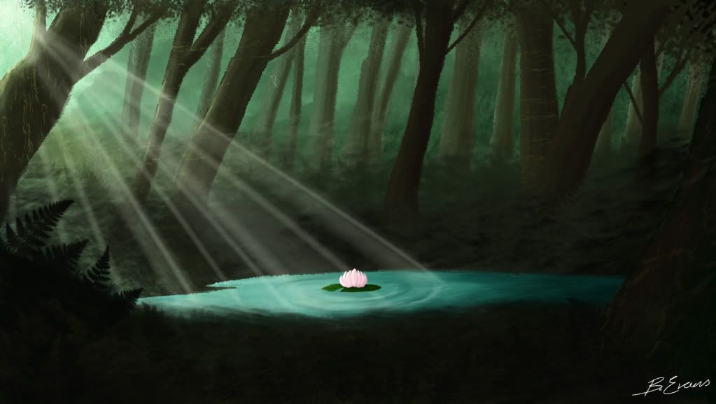
I noticed I hadn't really had a good think about what her environment would look like, now that I'm fairly sure my story wont change much, and that the story will start the day after the storm I decided to do a little photoshop painting of what possibly might be what the final background may look like.  With the use of different photoshop brushes and textures along with expensive research in colour of forests I had a go at practically my first background fully coloured concept art.

Process:

First of all I roughly drew out the layout of the scene, such as the trees, background and foreground and where exactly the pond was going to be, it had to be in the middle as it the centre of the story.


Photobucket

I then decided where the light source was coming from,  I chose the left as that is the most comfortable for the eyes to read, and I was the light source to connotate a positive reaction despite it's heavenly appearance at the end result.  I also started setting up the background trees and the misty background, it had to seem never ending.

Photobucket

I then started to colour in the foreground trees an illusion of depth is starting to appear.  Along with some use of textures on the trees to make them seem less flat.

Photobucket

I then started to apply the ferns and undergrowth in between the trees.  I also started to add some darker shades onto the right side to add a real light vs dark sense of the film.

Photobucket

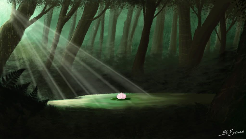
I then added the much darker fern foreground and added a lilly pad and made the light and dark much more contrasted.  I was unsure whether to make the pond a pure blue or a mucky green.  Green does seem more natural but blue does make the pond seem a lot more special.  I will get some feedback to see if this sort of style is suitable for my film.


Photobucket

Photobucket